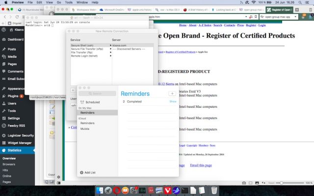
Here is the nasty truth: the user interface software Apple uses in its MacBook laptops and iMac computers is seriously outdated.
In other words, Apple computers suck. Compare a Mac’s user interface to a modern user interface, like Windows 10, and you have to admit that someone has mastered her homework while the other one has lost her vision and only enjoyed success that once seemed never-ending. I claim that the user interface of macOS is 10 years behind Windows 10, at least.
I am talking about Apple’s line of computers, MacBooks and iMacs, that are running the macOS operating system (I am currently running Sierra version 10.12.5). This operating system is based on Unix software. Apple has developed its own graphical user interface on top of Unix.
In fact, Unix is the best thing in Apple’s macOS software. The Open Group has certified that it really is Unix. For anyone who codes anything – web pages, enterprise applications, php scripts – having a full Unix under the graphical user interface is a great time saver and testbed.

Apple introduced the OS X operating system software in 2000, and shipped it in 2001. MacOS is the same as OS X, Tim Cook just recently updated the name. When Steve Jobs introduced the brand new software 17 years ago, it was specifically the user interface that got people excited. It was simply amazing at the time.
Plenty of development has happened in OS X/macOS during the past 17 years, but in essence, the user interface is still the same. Yes, the dock icons are cute, but so what?
The worst thing is the windowing and the menu system of the macOS user interface software. Look at the user interface of Apple’s mobile operating system, iOS. It is consistent. Or Android, or Windows 10. Consistent and intuitive. The windows and menus behave rationally and you find them in the same places wher you found them the last time.
The windows and menus in macOS live in parallel universes that are not quite sure how to interact with each other, if at all. An application window at the bottom of the screen has its menu at the top of the screen. An application window has problems of remembering all the other windows opened in the same application. Copying, moving and working with files in Finder is nearly impossible unless you open multiple Finder windows. The installation process of applications from outside the App Store occasionally reminds me of apt-get, a Linux command prompt installation program.
I understand that many Mac users open one application, fill the whole screen with it and are happy that it works the way it does. Because computers are very efficient multitasking machines, I want to exploit that feature and run several applications and windows simultaneously. On a computer, it must be easy and quick to switch between application windows.
I use both Mac and Windows computers at my work. Sometimes, I use both of them during the same day, but usually, I may work two weeks on a MacBook and then, two weeks on a Windows laptop. I also use smartphones, tablets, ereaders and perhaps a camera during a day. Experiencing many different user interfaces during an hour of work is normal. There is only one user interface that constantly bugs me: macOS on my MacBook laptop. It just doesn’t fit in today’s world. It lives in the past and is burying itself deeper in the past every day.
Microsoft has taken multiple courageous steps in order to keep Windows operating system’s user interface relevant. If we look back at the last 17 years of Microsoft’s PC operating system, Windows XP and Windows 7 were successful, although both included major changes in their user interfaces. Windows Vista and Windows 8 were less successful, many people hated them and switched back to the old version. Windows 10 development team could take all the learnings from the previous version that wasn’t popular, and created a really solid user interface for Windows 10.
Microsoft Windows is 10 years ahead of Apple macOS user interface, at least. Windows 10 fits right in to today’s world of tablets, smartphones, ereaders, cameras, and other devices we daily use.
MacOS was designed at a time when we purchased mobile phones for making phone calls and for sending text messages from a black-and-white screen of four rows of forty characters, two megapixel digital cameras were a novelty, Facebook didn’t exist, tablets only cured diseases, home automation meant buying a dishwasher, and being online all the time was impossible because of ultra-high mobile network costs.
One piece of software – in addition to the underlying Unix – on Mac computers is brilliant. It is the iBooks Author application used for creating ebooks. The books laid out in the iBooks Author may have video, audio and animation elements as well as interaction with a (human) reader. It is possible to create smart, useful and beautiful ebooks, like text books, travel guidebooks and other nonfiction works in iBooks Author. This Apple application compared to its competitive products reminds me of times when Apple computers were number one machines in everything that involved graphics and laying out publications.
Perhaps my only option is to wait and hope Apple does something about its software that is powering its computers. But I won’t wait for long. There are always other choices.


After reading your headline, I immediately unsubscribed.
Won’t be reading any more of your articles, Windows 10 is terrible to use compared to MacOS.
Where’s the informative comparison between the products?
It doesn’t really matter about the origins of The Mac OS. Is it fit for purpose? If it is then why change it.
Overall the Mac OS works pretty good and I can find all my files, move and delete them.
VERY “Millennial” perspective: everything new is great, and everything old sucks. Not much reality in that point of view. It is even more interesting that the author agrees something even older called “Unix” is such a good thing!
Story writing: C+
Technical expertise: F
Quite literally the dumbest thing I’ve read on the internet today. Grow up.
“THIS IS WHY THE AUTHOR AND KLAAVA SUCKS, BUT INTELLIGENT PC AND MAC USERS DON’T”
This is pure lede-bait by an author too ignorant of the subject matter to merit consideration and a publisher/editor that cares only about page views and profits rather than quality of content. So, macOS 10.13 is 10 years behind Windows? That puts it on par with Windows Vista of 2007 in the author’s view. I use and enjoy all platforms, and have since the late 70’s. Few, if any, PC users would compare Vista favorably to any OS, let alone a modern OS. The author notes the UNIX origin of OS X, no great revelation given its evolution from NExT, but is apparently ignorant of the similar origin of NT, that served as the basis for WinXP onwards. The primary gripe appears to be windowing and menus. Yes, menus live at the top and change to match the focus app on macs but live in the windows on PC. So what? It’s always been like that. I find the former more consistent and logical, but it’s basically a convention. It’s certainly nothing that has ever impacted the sales or popularity of either, and it has nothing whatsoever to do with the “modernity” of the OS. Regarding windowing, the author is unaware of or chooses to ignore the existence of utility apps. Don’t like it? Stop crying and do something about it, or stop using macs. The generally increasing market share of Mac users suggests this is a non-issue. As for the Finder, same response. But for most Mac users, Finder is preferable to current Explorer/former FileManager. Get Info and Preview features are notable advantages of Finder, but both get the job done equally well or countless third-party alternatives exist. The author is just doing it wrong. Try drag and drop. The last critique is the one-OS-to-rule-them-all trope. Apple studied it and decided touch to desktop/laptop screen is bad design and not ergonomic. Microsoft did too and came to the opposite conclusion. The TouchBar and maybe a future “TouchPad” in lieu of trackpad are Apple’s solution. As always, the market will decide and the loser will adapt or suffer the consequences. I prefer my hands on the keyboard and a smudge-free screen, but that doesn’t make me feel the need to scream Win8-10 sucks. My 14-yr old son and friends all seem to have adapted to touch on laptops, but revert to mouse/keyboard for serious gaming. My magic 8-ball says voice and gestures will ultimately prevail for UI, and I agree because, Star Trek/SciFi. But, yeah, iBooks Author is “amazing.” Q.E.D. Site unsubscribed.
Actually, this has some truth. Finder is the worst piece of garbage design ever. What do you mean you can’t cut and paste, only copy and paste….. really????
Copy: CMD + C
Move: CMD + Option + V
Essentially the same as cut and paste. Use it all the time.
Oh and what a rubbish article. Agree with earlier sentiments, click bait. Pure and simple. Just a wall of text, no real break down. Probably a marker of the quality this website produces.
Dislike.
Just sent this to a friend at Apple corporate. Having a great laugh over your ineptitude, and also wondering how you managed to convey this article using only your ass hole as a method of typing!
“the user interface is still the same”
AND…?
“Or Android, or Windows 10. Consistent and intuitive. The windows and menus behave rationally and you find them in the same places wher you found them the last time.”
BULLSHIT. Only on Apple do you find the menu in the same place all the time, you twat.
“The windows and menus in macOS live in parallel universes that are not quite sure how to interact with each other, if at all.”
You’re an idiot.
“An application window at the bottom of the screen has its menu at the top of the screen.”
Yes, it’s ALWAYS at the top. THIS IS CONFUSING HOW? You want the menu to move around the universe so that you little Seattle Bill Gates monkey feels nice?
“An application window has problems of remembering all the other windows opened in the same application.”
Bullshit.
“Copying, moving and working with files in Finder is nearly impossible unless you open multiple Finder windows.”
It’s a fucking WINDOWING OS you twat.
“The installation process of applications from outside the App Store occasionally reminds me of apt-get, a Linux command prompt installation program.”
Fuck me you’re ignorant. The install process is to drag the fucking application to wherever you fucking want to. HOW FUCKING SIMPLER COULD THEY MAKE IT FOR A TWAT LIKE YOU?
What utter trash. Many of the things you said are subjective at best and flat-out lies at worse. Not returning to this tabloid-esque, sorry excuse for a news site.
A lot of hate here. personally, i only touch macs if fixing for somebody else. most recent example was changing an email pasword and “unable to verify account name or password”. thought i was going nuts. turns out it is a bug in HS. Such a joke. you have to tab off the password field for it to remember it. Utter garbage. Oh and having to hold down shift for realiable caps LOCK whilst typing really sucks too (so i didn’t bother). I guess if you have just spent 3 grand on a laptop the you have to justify it to yourself somehow lol. The hardware seems to be getting more and more shoddy as time goes on too.