
Many book readers, or readers of any kind of text, don’t give a second thought to the fonts that represent the visual image for each letter. Times Roman may have been the most popular font on printed matter, but is rarely seen on a computer, tablet or smartphone screen. There is a reason for it: the smaller the font size is, the simpler its design has to be to make it readable. The font can’t be so simple that letters look the same.
Typeface designer Tobias Frere-Jones recently released a new font titled Mallory specifically designed for small screens. In an interview to Digiday, he explained that the key factor that makes a font easily readable on a screen is to space the letters out, enlarge the interior of each lowercase, and simplify details.
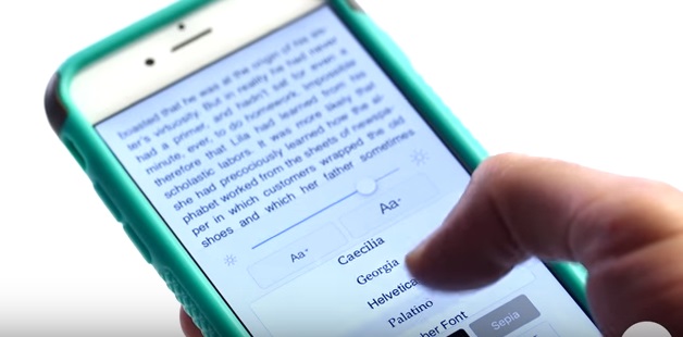
Typographers have been aware of the solution for hundreds of years, so the technique itself is nothing new. What is new is that human kind is moving from reading texts on paper to reading text on screen. The font size is easy to change on the screen, allowing readers themselves to affect how the content looks like. Many ebook reading applications have a feature that let you even change the font of a book on the fly.
Here is a video where Frere-Jones talks about his font design: